

The foodservice industry is preparing for a transformative change with the impending adoption of A2L refrigerants, drive...
2 min read
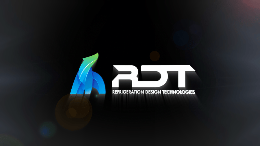
At the turn of the new year and new decade, we knew that something exciting was coming up. As the entire world took a pause to quarantine, we were hard at work implementing a big change for all of us at RDT: a brand new logo.
We spoke with RDT's president Brent Dyess, to learn more about what this new logo means to the company, it's industry-wide known values, and much more.
"In 2003, RDT made a decision to expand its reach to a national market. At that time, our company name was Refrigerated Design Texas and our company logo included the shape of Texas. Considering our expansion, and to appeal to a broader market, we changed our name to Refrigeration Design Technologies and removed the Texas shape. The 2003 logo was representative of cold air movement and included a swooping snowflake arching over a lowercase rdt."
The new RDT logo was a personal journey for Brent Dyess. When asked what it all meant, he replied, "RDT is in a good place. We're experiencing growth, we're upgrading our staff, improving our capabilities, and we're on the cusp of rolling out some new products. Considering the advancements and growth, it felt like the right time to make improvements to our branding as well."
Why the desire for a switch now? In 2008, RDT released the Eco-Cool, digital refrigeration system. It was important that RDT provided a sustainable system with greatly improved energy efficiency and lowered refrigerant volume to mitigate global warming potential. Shortly thereafter, Eco-Smart evaporator controller was introduced.Like the Eco-Cool, the Eco-Smart saves customers approximately 50% in energy costs. Dyess says, "It’s quite evident now that everything we do and every product we build keeps green initiatives in mind. Therefore, with our continued environmental mindset, we definitely wanted the new logo to have strong hints of green."
RDT's new polar bear logo actually has a name. As a play on words, his name is Artie – full name, Artie T. The word Art is of English, Celtic origin meaning "noble one; bear man". So, it actually fits!
The new logo and font has a sleeker, more modern design. Brent explained why; "RDT is anything but old-fashioned. We take a progressive approach on innovation and our products reflect forward-thinking sensibilities. So, we wanted our font to be bold, sleek and modern, indicative of our standing as front-line innovators of quality, state-of-the-art refrigeration systems. I’m truly proud of how it all came together."
Join RDT as they embark into a new, rich chapter of their journey as a company, and an industry leader in refrigeration. To learn more about the history of RDT and have a little fun, check out this post on 5 Things You Might Not Know About RDT.
To see more about RDT's green initiatives, check out this video on Eco-Cool:
RELATED BLOGS


Legacy Records is one of the latest endeavors from one of New York City's hottest restaurant groups. Delicious Hospitali...

The technological revolution has changed nearly every aspect of society, including within the foodservice refrigeration ...